I like infographics. They are informative, interesting and enjoyable to read. They’ve usually got some good stats and always present information in a way that it is easy to digest. They are pretty great in general. But – yes, there is always a but – you have to be careful. It is all too easy to get carried away with the pretty colours, creative fonts and convincing statements. Sometimes, you can be misled. Let’s take a look at this painkiller infographic.
NSAID Painkiller Infographic
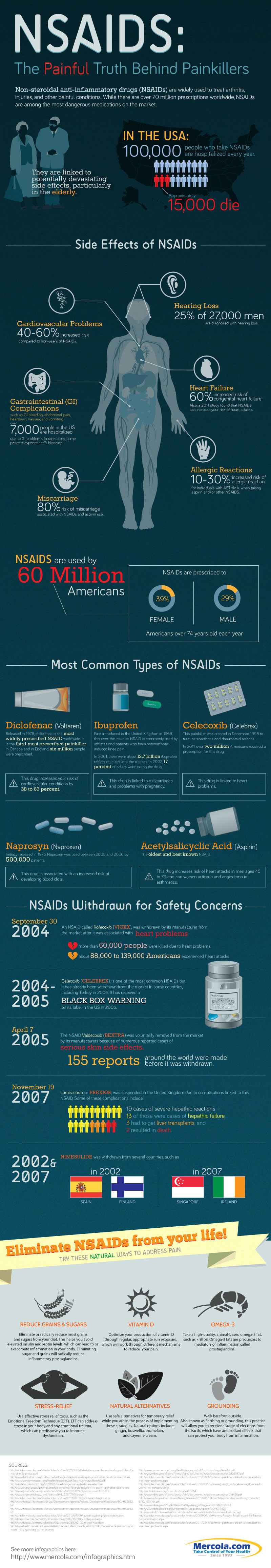
Let’s do a little experiment. Below, is an infographic entitled “NSAIDS: The Painful Truth Behind Painkillers”. I would like you to have a quick look through it, just a 30 second scan the way you would usually read an infographic.
Start with that, and we’ll get to the next part afterwards.
All done? Great. Now I’ve got a few questions.
What stuck out to you most about the infographic?
What did you learn?
Did it change your opinion about using NSAIDs as painkillers?
Are you currently taking NSAID medication, or do you know someone who is? How did it make you feel?
Now let’s start looking at it bit by bit.
Interpreting Medical Information in the Painkiller Infographic
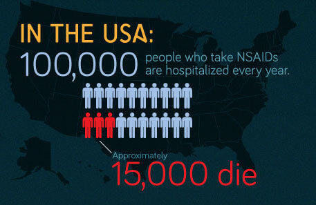
This part looks pretty serious, right?
The three red men in every lot of twenty die because of NSAID medication.
Well, I’d prefer to say that this is like one of those people who fluff their stories up with the right details to make it seem more exciting. It’s warping the truth to make the story seem a particular way.
Firstly, NSAIDs don’t necessarily cause the deaths – people are merely taking NSAIDs at the time they died. In fact, it is highly likely they could be taking the NSAID for pain relief when the condition causing the pain ends their life.
Next, there are not three deaths for every twenty people taking NSAIDS, but 3 in every 20 people who are taken to hospital. That’s an entirely different kettle of beans. Given the population of the USA (313.9 million in 2012) and the frequency of NSAID use, 15000 deaths whilst taking NSAIDS is comparatively small. Still something to be worried about, but the three red men in every twenty picture doesn’t quite do it justice.
Then there are all the things that can go wrong when taking NSAID medication.
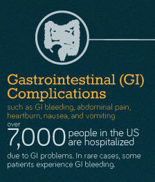
Gastrointestinal complications are a big one. Here the infographic has some good information – bleeding, abdominal pain, heartburn, nausea and vomiting are very common with NSAID use. However, this is mostly due to the way that they are used, not simply because people take them.
NSAID medications can be very severe on the gastrointestinal tract but there is an easy way we can reduce the risk of these happening. All we need to do is eat some food with, or just before, taking an NSAID. This sort of “lines” the stomach and gastrointestinal tract, protecting it from the damages NSAIDs can have directly on the tract.
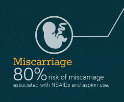
This one, once again, depends on the way NSAIDs are used. It is true that it is dangerous to take an NSAID during pregnancy because there is an increased risk of miscarriage. But the obvious solution is to simply avoid their use in pregnancy. The rest of the time, for the majority of the population, this risk is not at all relevant. You just have to be aware and use NSAIDs correctly, at the right time.
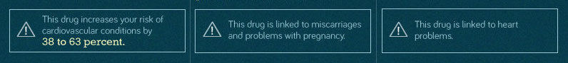
Then the infographic moves on to specific example of drugs, with warning exclamation marks for each one. I find this interesting because the majority of the NSAIDs drugs (if not all) have been linked to all of these things. It is not that diclofenac is particularly bad for cardiovascular problems, ibuprofen for miscarriages and celecoxib for heart problems.
All of these drugs can have each of these effects.
I suppose it is presented this way, for the average reader to link different drugs to different problems, but it presents issues of misinformation to the reader and unneeded anxiety about drugs that they could already be taking.

This is purely a scare tactic.
It makes people think there must be something wrong with them if they were withdrawn from the market in other countries. While this is something to consider, many drugs are withdrawn from the market for a whole host of reasons. It is also worth noting that some NSAIDs (notably ibuprofen and aspirin) have become less regulated with time as we become more comfortable with their use, such that they are now available to be purchased in supermarkets without any form of professional advice (whether or not this is a positive decision, I’ll leave for another post).

Then the painkiller infographic leaves a final message lingering in the reader’s mind, “Eliminate NSAIDs from your life!”
This is where I start cringing.
Yes, there are natural products available and everyone who uses NSAIDs should be trialling these to aid in their pain relief.
Yes, there are some serious side effects that NSAIDs present and require careful management and help from a doctor of pharmacist to manage.
But this does not mean that you should eliminate NSAIDs from your life.
There is a place for NSAIDs in pain management. They really do help and should not be disregarded as a viable option.
More importantly, people who are taking NSAIDs should not be made to feel that they are doing their body harm by listening to their doctor’s instructions to take NSAIDs for their pain. That is unnecessary anxiety that doesn’t need to be fuelled.
But – once again, there is always a but – this doesn’t mean I condemn this infographic. Indeed, I wouldn’t be sharing it with you if I didn’t think there was something positive to come of it.
What it does, is bring to the attention of everyone that NSAIDs can be dangerous. This is a good thing. People should know that drugs can be dangerous and they should know what they are capable of doing. In this way, they take more care to use them correctly and can recognise if they are getting some of the known effects and do something about it before it’s too late.
There are also probably some people taking NSAIDs that could suffice with natural options or other medications – and for these people the painkiller infographic could serve as a healthy reminder to consider if they still need to take their NSAID medication.
A Final Note
What we need to realise is that infographics are the tall tales of today. They start out with the truth and then exaggerate until the message is a little starker. Just like this painkiller infographic.
It gets more attention that way and infographics like attention.
But you are above that – you just need to think and consider each part for yourself and how it applies to you.
Just remember that infographics are like your friend who, that one time when no one was around, caught a fish bigger that the boat he was fishing from so he had to throw it back in.
There’s truth in there, but the way they tell it makes it seem a lot more impressive.
Pin this article for later: